* Werbung
Sollte man mich fragen, was eine meiner Lieblingsbeschäftigungen ist, würde ich spontan wahrscheinlich “Geschenke verpacken” sagen. Ihr wisst schon, ich verpacke Geschenke wirklich sehr gerne und bin immer auf der Suche nach neuen Ideen und Materialien.

Als ich von der amerikanischen Firma Speedball (die Ihr wahrscheinlich durch Stempelgummi kennt und mit der ich auf der Creativeworld Messe gesprochen habe) das Kalligraphie Set zum Testen bekam, dachte ich aber noch nicht an Geschenkverpackungen… ich wollte erst einmal sehen, was das Set beinhaltet und wie die Qualität ist.
Im Set enthalten sind zwei Federhalter (gerade und oblique), Feder (C2 – breit und 512 – schmal), 12 ml schwarze Tusche und 12 ml Federreiniger, ein Kalligraphie-Stift, ein 50 Seiten Block (liniert) und das Textbook. In der Beschreibung stand, dass nur eine schmale Feder enthalten ist, dabei waren aber drei :-).
Zuerst habe ich mir das Buch angeschaut. Das hier ist die 24 Edition – das Textbook wird seit 1915 herausgegeben und wurde in dieser Zeit immer wieder aktualisiert. Es ist in sieben Kapiteln unterteilt: “Werkzeuge, Tipps & Techniken”, “Alphabet (bzw. Schriften) Stile”, “Lettering mit Druck”, “Kommerzielles Lettering”, “Layout & Design”, “Kontemporäres Lettering” und “Dekoratives Lettering”, wobei die ersten drei Kapitel die ausführlichsten sind.
Sehr interessiert habe ich mir das erste Kapitel angeschaut, es sind wirklich sehr nützliche Tipps darin enthalten, zumindest für mich als Anfänger. Ich nehme an, Fortgeschrittene werden schon viele dieser Infos schon kennen, ich finde das Buch aber dennoch gut, weil alle Infos an einer Stelle zusammengefasst sind und man kann es immer wieder als Referenz benutzen. Das Buch gibt es wohl nur auf Englisch, es gibt aber sehr viele Zeichnungen, so dass man es auch so verstehen kann, wenn man die Sprache nicht sehr gut beherrscht.
Es werden viele Alphabete bzw. Schriften und Schriftarten gezeigt und bei den meisten steht auch die Reihenfolge, mit Zahlen und Pfeilen versehen, in der man die Striche der einzelnen Buchstaben ziehen soll.
Außerdem gibt es diverse Beispiele von Schilder- und Kreide-Lettering – sehr “in” zur Zeit – und dekorative Buchstaben, Bordüren und Initialien.
Bevor ich aber Beispiele und Übungen aus dem Buch testete, wollte ich mir die Feder, die Federhalter und den Kalligraphiestift genauer anschauen und ausprobieren. Die Federhalter sind beide aus Kunststoff, fühlen sich aber gut in der Hand. Ich habe bisher nur Holzfederhalter benutzt, sie sind mir ein bisschen stabiler in der Hand, mit den Speedball Halter hatte ich aber eigentlich keine Probleme. Bisher hatte ich noch nicht mit einem Oblique-Federhalter gearbeitet, hatte aber mehrfach gehört, dass diese eigentlich viel besser als die geraden sind, auch wenn etwas gewöhnungsbedürftiger, weil wir alle daran gewöhnt sind, mit “normalen”, geraden Stiften zu schreiben. Ich habe diverse Linien – abwärts, aufwärts, horizontal, vertikal und gebogen gezeichnet.
Am besten gefällt mir die breite Feder, da sind die Unterschiede zwischen dicke und dünne Linien am deutlichsten. Die schmale Feder ist schon sehr fein und sicherlich gut, um damit zu zeichnen. Der Stift hat keine runde Spitze, wie bei den normalen Stiften, sondern eine Kalligraphie-Spitze, so dass man damit sowohl feine, als auch breitere Linien ziehen kann. Sicherlich eine durchaus gute Alternative, wenn man gerade keine Feder und Tusche parat hat.

Hier ist ein Beispiel, wie man mit den mitgelieferten Federn und dem Stift schreiben kann. In diesem Fall gefällt mir fast besser die Schrift der schmalen Feder, vielleicht ist diese Schriftart für die dickere Feder nicht so gut geeignet. Übrigens kann man beide Feder mit beiden Federhalter benutzen. Etwas zur Tinte: sie ist nicht zu dick (ich habe immer wieder Probleme mit Tuschen anderer Hersteller, weil sie mir zu schnell auf der Feder trocknen), es könnte aber etwas mehr im Gläschen enthalten sein. Ein bisschen Probleme hatte ich damit, dass beim erneuten Aufnehmen der Tusche mit der Feder etwas zu viel darauf landete und die neuen Striche dadurch zu dick wurden, dieses Problem habe ich aber mit allen bisher benutzten Tuschen und ich bin auch wirklich am Anfang mit der Kalligraphie und das ist vielleicht auch eine Übungssache, wie alles andere auch.
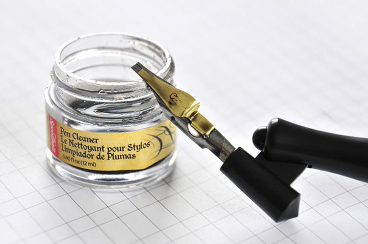
Bisher habe ich meine Feder nach dem Schreiben gewaschen und mit einem Tuch abgetrocknet (damit sie nicht verrosten), sehr praktisch finde ich aber das Gläschen mit der Reinigungslösung für die Feder. Ich würde danach aber die Feder trotzdem mit einem Tuch abtrocknen.
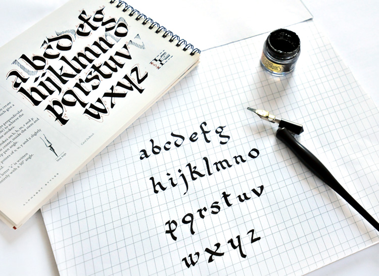
Wie schon erwähnt, bei vielen Schriftarten wird auch die Reihenfolge der Striche für die einzelnen Buchstaben angezeigt und so habe ich mir eine Schrift ausgesucht und mit der breiten Feder auf dem im Set vorhandenen Block nachgezeichnet. Ich weiß leider nicht, ob der Winkel, in dem ich die Buchstaben geschrieben habe, richtig ist (im Textbook sind bis auf wenigen Fälle die horizontalen und schrägen Hilfslinien – wie im Block – nicht angezeigt), aber ich habe mich bemüht, alles richtig zu machen und fürs Erste bin ich auch zufrieden. Übung macht den Meister… Jedenfalls finde ich diese angegebene Strichreihenfolge sehr gut, denn bei einigen Buchstaben hätte ich instinktiv anders gezeichnet.
Das Papier des Blocks ist fein, die breite Feder gleitet gut darauf, die schmale war mir ein ganz bisschen zu kratzig, vielleicht hatte ich aber auch nicht den richtigen Winkel erwischt.

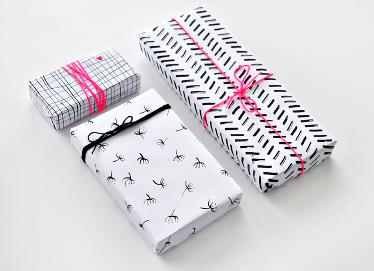
Während ich all das ausprobierte fiel mir ein, dass man mit Kalligraphie-Federn nicht nur schön schreiben, sondern auch zeichnen kann. Ich habe von meinem Vater diverse sehr detaillierte Zeichnungen, die er ausschließlich mit Feder und Tusche gemacht hat, aber bis ich sein Niveau erreiche, muss ich lernen, den Federhalter richtig zu halten und mit kleineren Übungen anzufangen. Wie z. B. einfache graphische Zeichnungen auf weißem Papier, das ich dann als Geschenkpapier nutzen wollte.
Ich habe drei verschiedene Muster gezeichnet: mit der schmalen Feder matrix-artige Linien und Pusteblumen-Samen, mit der breiten Feder einigermaßen parallele, schräge Linien in einem chevron-ähnlichen Muster. Das Ganze muss jedenfalls sehr gut getrocknet sein, bevor man das als Geschenkpapier verwendet – gerade bei den dicken Linien dauert es ein bisschen länger. Die Regelmäßigkeit der gezogenen Striche und der Handbewegung macht daraus eine sehr entspannende Übung, für mich war das zumindest so.


Die Geschenke sind eingepackt, nun können sie so “pur” bleiben oder mit kleinen Details und dann auch Bäckergarn oder Schleifen verziert werden. Ich habe mich hier für eine Kontrastfarbe – Neon Pink – entschieden, ich denke, das sieht besonders schön aus zu den schwarz-weißen Mustern.


Auch wenn ich mir auch eine weiße Tusche im Set gewünscht hätte, weil ich damit unheimlich gerne auf dunklerem Papier schreibe oder zeichne, kann ich alles in allem dieses Speedball Kalligraphie Set insbesondere Anfängern empfehlen. Es ist alles dabei, was man braucht, man muss nur loslegen. Fortgeschrittene werden vielleicht andere, “maßgeschneiderte” oder handgemachte Federhalter aus Holz oder anderes Papier bevorzugen, werden aber sicherlich auch interessante Tipps und Informationen im Textbook finden. Mehr Tuschefarben und mehr Feder und Federhalter sind übrigens im “Collectors Set” enthalten, das sogar in einer Holzbox kommt.
Habt Ihr schon Erfahrungen mit Feder und Tusche gesammelt? Wie benutzt Ihr gerne Kalligraphiefeder, lieber nur zum Schreiben oder auch zum Zeichnen? Was für Muster würdet Ihr auf Papier zeichnen, damit Ihr schönes Geschenkpapier bekommt?

* Dieser Blogpost ist in Kooperation mit Speedball, USA, entstanden. Vielen lieben Dank für das Set, das mir zur Verfügung gestellt wurde, es hat richtig viel Spaß gemacht, es ausführlich zu testen! Das Textbook durfte ich mit Erlaubnis von Speedball fotografieren. Alle Bilder sowie der Text und die Meinung sind, wie immer, meine eigene.
Link: Handmade on Tuesday

frau nahtlust sagt
Wunderbar – das sieht nach einer herrlichen Beschäftigung aus, in die man vermutlich direkt und unmittelbar versinken kann. Danke für die Tipps.
LG. Susanne
Fee von fairy likes... sagt
Ich bin mal wieder begeistert von deiner Geschenkverpackung, liebe Ioana! Eine tolle Idee, sie selbst mit Tusche zu gestalten. Und das Set sieht auch interessant aus… Lieben Gruß von Fee
Doro sagt
Das ist ja eine tolle Idee mit dem Geschenkpapier! Mir gefällt vor allem der Touch pink dazu.. Super. ich wäre ja nie auf die Idee gekommen..
Für mich ist Kalligraphie leider auch nichts, da bin ich ein bisschen zu untalentiert. Schade 😉
Tintenelfe sagt
Super hübsches Geschenkpapier! Besonders die pinken Highlights gefallen mir sehr gut!
Liebe Grüße, Sandy
Claudia sagt
Dein Geschenkpapier kannst du drucken!! Super schönes Design!
Und jetzt habe ich Lust meine alten Federn wieder rauszusuchen. Ich habe tatsächlich damals das Glück gehabt, in der Schule im Kunstunterricht erste Begegnungen mit Federn und Tusche gehabt zu haben und es hat mich nie wieder losgelassen.
Liebe Grüße vom Deich zu dir Ioana
Claudia